
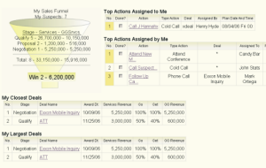
The Personal Dashboard shows each user a quick view of their assigned Deals and Actions (tasks).
Take a look at our brochure to learn more about this dashboard and the Manager's Dashboard.
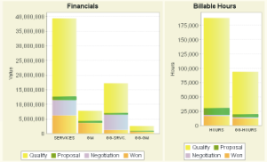
Graph 1: Financial Data by Sales Stage, Graph 2: Billable Hours by Sales Stage.
See the Difference
Selling services is not the same as selling products. The sales tools you need are different too. Scroll down to see some of the differences for yourself.
Which Deals do We Chase?
You can't chase every sales opportunity. Some proposals require significant time and cost to put together. How do you evaluate all the opportunities and decide which Deals to chase?@sales will organize your sales opportunities and present the data so that you can see the whole picture.
Is it a Go and Will We Win
It takes time for some projects to firm up. @sales helps by allowing you to assign Go and Get probabilities to each sales opportunity. Go is the probability that the project will materialize. Get is your probability that you will win the opportunity if it is a Go.@sales will help you track any stage of opportunity and its current state. It uses Go and Get probabilities to calculate factored values for the opportunities that you are chasing.
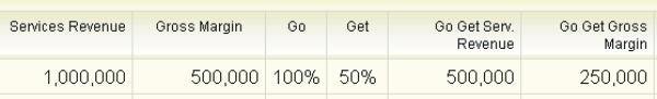
Above is a closeup of the Deal Review Screen (shown below). It shows Go and Get Factored Values for Revenue and Gross Margin for a Deal.
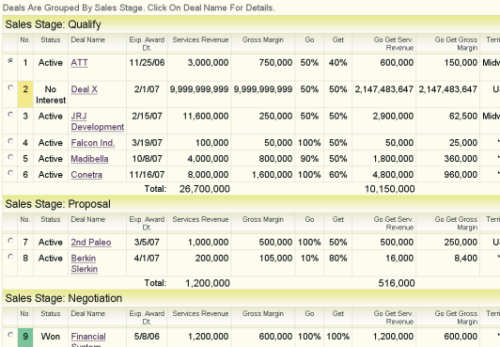
The Deal Review Screen groups Deals by Sales Stage. A green marker identifies Deals that have been won. An amber marker identifies Deals that you will decline to bid. Click on a Deal Name to popup details for the Deal.
The Going Out of Business Curve
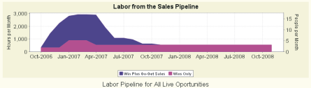
The Labor Pipeline Chart shows a forecast of billable hours
from sold and unsold Deals.
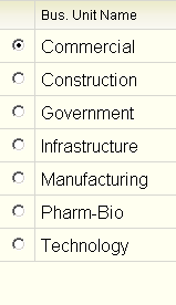
Enterprise Edition let's you
define and review Deals by Business Unit.
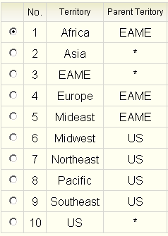
Enterprise Edition let's you define and review Deals by Sales Territories.
Businesses that sell professional services have a hungry monster that consumes billable hours. Operations managers need to understand where new projects are going to come from and when they will arrive.
The Labor Pipeline shows a forecast of billable hours from sold and unsold projects (bids). The trailing edge of the curve indicates when billable hours will turn into overhead. Organizations try to keep the trailing edge of the curve as far out in the future as possible.
Do you know what this curve looks like for your organization? If you do you know how hard it is to gather the data and to create it. @sales will show it to you with one click.
@sales Enterprise Edition provides additional capabilities for large companies:
- Create Business Units (company divisions), Sales Territories and Sales Sub-Territories that fit your business.
- @sales Enterprise Edition adds three additional User Roles:
Enterprise Manager, Business Unit Manager, andTerritory Manager. - Assign Territories and Business Units to your sales force.
- Assign Managers toTerritories and Business Units
- Associate Business Unit, Sales Territory, and Executing Office to sales opportunities.
Got a question?
Click here to use our contact form, or email us at:
